

Basic Exploratory Data Analysis (EDA)


Exploratory Data Analysis (EDA) is used to analyze and investigate data sets. It's to get better insight into the data set so that we can summarize their main characteristics. The better you understand the data, the better model you will make. Having better insights will help you in doing better feature engineering. The IBM Blog's says that
Exploratory data analysis (EDA) is used by data scientists to analyze and investigate data sets and summarize their main characteristics, often employing data visualization methods. It helps determine how best to manipulate data sources to get the answers you need, making it easier for data scientists to discover patterns, spot anomalies, test a hypothesis, or check assumptions. EDA is primarily used to see what data can reveal beyond the formal modeling or hypothesis testing task and provides a provides a better understanding of data set variables and the relationships between them. It can also help determine if the statistical techniques you are considering for data analysis are appropriate. Originally developed by American mathematician John Tukey in the 1970s, EDA techniques continue to be a widely used method in the data discovery process today.
Let's have a basic EDA on Iris dataset in scikit-learn.
from sklearn import datasets
import pandas as pd
import numpy as np
import matplotlib.pyplot as plt
import seaborn as sns
plt.style.use('ggplot')
iris = datasets.load_iris()
type(iris)
print(iris.keys())
sklearn.datasets.base.Bunch
dict_keys(['data', 'target', 'frame', 'target_names', 'DESCR', 'feature_names', 'filename'])
Regarding plt.style.use('ggplot'), it's used to style the plots. Generally people use ggplot, you are free to choose whatever looks good to you!
print(plt.style.available)
[‘Solarize_Light2’, ‘_classic_test_patch’, ‘bmh’, ‘classic’, ‘dark_background’, ‘fast’, ‘fivethirtyeight’, ‘ggplot’,’grayscale’,’seaborn’,’seaborn-bright’,’seaborn-colorblind’, ‘seaborn-dark’, ‘seaborn-dark-palette’, ‘seaborn-darkgrid’, ‘seaborn-deep’, ‘seaborn-muted’, ‘seaborn-notebook’, ‘seaborn-paper’, ‘seaborn-pastel’, ‘seaborn-poster’,’seaborn-talk’,’seaborn-ticks’,’seaborn-white’,’seaborn-whitegrid’,’tableau-colorblind10′]
type(iris.data), type(iris.target)
print(iris.data.shape)
print(iris.target.shape)
print(iris.target_names)
(numpy.ndarray, numpy.ndarray)
(150, 4)
(150,)
array(['setosa', 'versicolor', 'virginica'], dtype='<U10')
X = iris.data
y = iris.target
df = pd.DataFrame(X, columns=iris.feature_names)
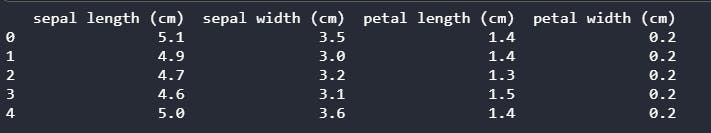
print(df.head())
df.info()
<class 'pandas.core.frame.DataFrame'>
RangeIndex: 150 entries, 0 to 149
Data columns (total 4 columns):
 #   Column             Non-Null Count  Dtype
---  ------             --------------  -----
 0   sepal length (cm)  150 non-null    float64
 1   sepal width (cm)   150 non-null    float64
 2   petal length (cm)  150 non-null    float64
 3   petal width (cm)   150 non-null    float64
dtypes: float64(4)
memory usage: 4.8 KB
df.describe()
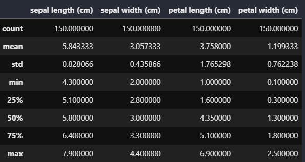
df.describe() method provides various statistical information such as count, mean, standard deviation, minimum value etc.
The x% means x percentile, meaning that x % of total are less that or equal to that value. In this case for example 75 percentile of flower's sepals length is less than or equal to 6.4cm
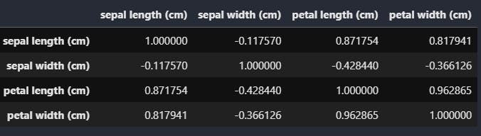
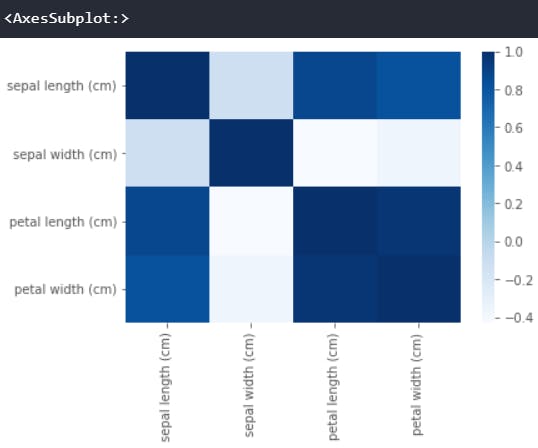
Correlation matrix is a matrix showing the correlation coefficients between variables. One can also use a heatmap to visualize the different correlation between variables.
df.corr()
sns.heatmap(df.corr(),cmap='Blues',annot=False)
Scatter Matrix plots all the pairwise scatter between different variables in the form of a matrix.
SM = pd.plotting.scatter_matrix(df, c = y, figsize = [10, 10], marker = 'D')
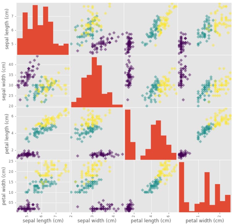
In this example the three colors show the three species:
- Versicolor
- Virginica
- Setosa
EDA is a vast and a good technique to understand and in a way visualize the data in a better way. If you want to tweak and play with the code then you can do so in this Kaggle notebook by clicking click and edit button on the top right of the page.